Understanding KPIs in Mobile Games: A Complete Guide - part 1
There are several key performance indicators (KPIs) and metrics that are essential for understanding and optimizing user acquisition. These metrics help you assess the quality of traffic and user engagement, which is crucial for the success of your app or game. Below, I’ll explain each KPI, provide examples, and suggest how to analyze them, accompanied by a description of visualizations you can use.
1. Downloads (Installs)
Definition: The total number of times your app is installed by users.
Why it matters: Downloads are the starting point for understanding how well your app is attracting new users.
Example: Your app receives 10,000 installs in a month, but only 2,000 users are still active after the first week. This suggests that you may need to improve your onboarding or user retention efforts.
How to analyze:
Organic vs. Paid: Analyze the breakdown between paid and organic installs to understand which source is more cost-effective.
Segment by source: Compare installs from different marketing campaigns, app stores, or countries.
Graph: A bar chart showing the number of installs per source (e.g., Google Ads, organic search, app store search).
2. K-factor (Virality Index)
Definition: Measures how viral your app is by looking at how many new users existing users invite to the app.
Why it matters: A high K-factor indicates strong organic growth, as users bring in more users without additional marketing spend.
Formula:
K-factor=Invites Sent per User * Conversion Rate
Example: If each user invites 2 friends, and 10% of those friends install the app, your K-factor would be:
2×0.1=0.22 \times 0.1 = 0.22×0.1=0.2
This means 1,000 users would bring 200 more users through virality.
How to analyze:
If the K-factor is greater than 1, the user base grows organically.
If the K-factor is less than 1, paid marketing efforts are needed to sustain growth.
Segment by user group: Track which types of users (e.g., those acquired via referrals) are more likely to invite others.
Graph: A line chart showing the number of invited users over time, along with the corresponding K-factor per period (e.g., weekly or monthly).
3. ROI (Return on Investment)
Definition: Measures the financial return on your acquisition costs.
Why it matters: ROI shows how effectively you’re turning marketing dollars into revenue.
Formula:
ROI=InvestmentRevenue−Investment×100%
Example: If you spend $500 on ads and make $1,000 in revenue, your ROI is:
((1000−500) / 500)×100% = 100%
How to analyze:
Break down ROI by campaign to see which marketing channels are most effective.
Track ROI over time to see how the performance of your campaigns changes (e.g., Day 7 ROI, Day 30 ROI).
Compare ROI across regions to find the most profitable markets.
Graph: A scatter plot showing ROI by campaign or a line graph tracking ROI over time.
4. ARPU (Average Revenue per User)
Definition: The average amount of revenue generated per user, including paying and non-paying users.
Why it matters: ARPU helps you assess how much value each user brings to your app.
Formula:
ARPU=Total Revenue / Total Users
Example: If you earn $10,000 in a month and have 5,000 users, your ARPU is: 10,000/5,000=2 USD per user
How to analyze:
Compare ARPU across different user segments (e.g., paying vs. non-paying users).
Track ARPU over time to see if user value is increasing as they spend more.
Use ARPU to evaluate the quality of different acquisition channels.
Graph: A bar graph showing ARPU per user segment or a line chart tracking ARPU over time.
5. Retention Rate
Definition: The percentage of users who return to the app after their first use.
Why it matters: Retention shows how well your app keeps users engaged. A high retention rate suggests a healthy user base.
Example: If you have 1,000 users, and 300 of them return after 7 days, your 7-day retention rate is: 3001000×100%=30%
How to analyze:
Track retention rates for different time periods (Day 1, Day 7, Day 30) to understand user drop-off points.
Compare retention by acquisition source to see which campaigns are bringing in more loyal users.
Use cohort analysis to track how different groups of users behave over time.
Graph: A cohort analysis heatmap showing retention rates over time, segmented by user acquisition date.
6. LTV (Lifetime Value)
Definition: The total amount of revenue you can expect to earn from a user over their entire relationship with your app.
Why it matters: LTV helps you determine how much you can spend on acquiring users. If your LTV exceeds your acquisition costs, you’re in a good position.
Formula:
LTV=ARPU×Average User Lifespan
Example: If your ARPU is $5 and users typically stay active for 6 months, your LTV is: 5×6=30 USD per user
How to analyze:
Compare LTV across acquisition channels to see which one brings the highest-value users.
Use LTV to calculate ROI and decide how much to spend on acquiring new users.
Track LTV growth as you improve user retention and monetization efforts.
Graph: A line chart showing the growth of LTV over time, or a bar chart comparing LTV across different acquisition sources.
7. CPI (Cost per Install)
Definition: The amount of money spent to acquire a new install.
Why it matters: CPI helps you understand the cost-effectiveness of your user acquisition campaigns.
Formula:
CPI=Total SpendTotal Installs
Example: If you spend $1,000 on ads and get 500 installs, your CPI is: 1000500=2 USD per install
How to analyze:
Track CPI for each campaign to identify which ones are delivering the lowest-cost installs.
Compare CPI across regions and platforms to optimize your budget allocation.
Aim to keep CPI below LTV to maintain profitability.
Graph: A bar chart comparing CPI across different campaigns or platforms.
Summary
Here’s a quick visual breakdown of the KPIs and their importance:
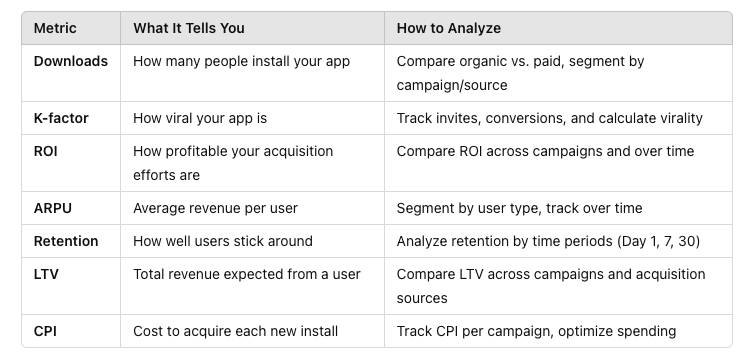
Main KPIs
By tracking and optimizing these KPIs, you can make informed decisions that will help you improve the quality of your user base and ensure the profitability of your app.